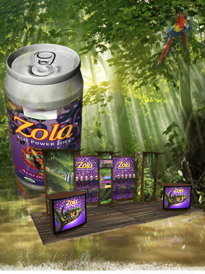
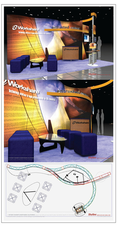
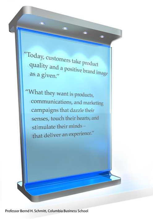
 We are living and breathing in an Age of Integration. Every action that we now undertake is or can be integrated with the larger system. The only limiting factors being our own imagination and if it is realizable computationally. Being an informed citizen of this age "requires the ability to apply computational ways of thinking to design, to writing, to experimentation, to artistic expression, and to problem solving – to the very core of human intellectual activity. In this age, our ideas are no longer constrained solely by what is physically realizable, but by what is computationally realizable. {Hence the popularity of de-constructivism in modern architecture} ........An artist is now able to create an artwork that only exists when someone interacts with it – specifying a framework within which each visitor can create a work of art. A chemist is now able to search more effectively for new compounds by modeling them before ever going into the lab. Nearly every discipline is changing, not just because of new tools but because of new computational ideas and paradigms." Source: Congressional testimony of Dr. Rita Colwell, Director National Science Foundation. In a trade show display design when we go twenty feet high with inset back-lit marquee picture cube performing as way finders, consolidated presentation areas as enthralling engaging elements, towering messaging collaborating with brand performance we can proudly attest to the fact that we have achieved efficiency in economics, engineering in scale and artistry in form. It is in the intelligent integration of form, function and fiscal competence that this booth design as shown above comes alive in a 20'x 20' island space. Okay, now what? Now that you have an integrated brand architecture dominating your space, how do you leverage your stance and integrate your prospects into clients and your clients into loyal brand ambassadors. Here are 2 directives that usually always works. One, know your audience. This is the key. We are at cross-roads of integrated cross generational and cross-cultural phenomena. Learn cross-generational marketing. Two, know marketing trends impacting events along with the integrating factor of attendee quality trends and exhibit performance trends. Download the white paper Evolving Exhibition Trends and their Impact on the Value of Exhibiting. Armed with the integrated dynamics of trends and targets you are now set for success at your next captivating trade show event. Good Luck! Articles you might like
0 Comments
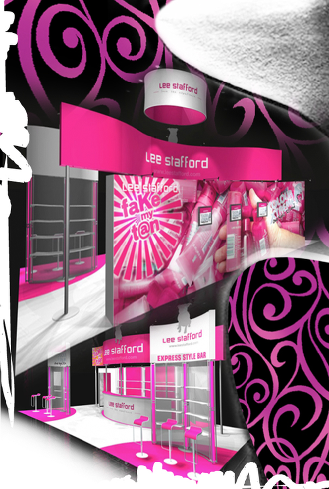 During the launch of Levi's Curve ID jeans in 2010, Levis launched a 5 week integrated marketing campaign that touched on experiential marketing, social media and outdoor events in shopping malls and city centers throughout the UK. Brand ambassadors for Levi's encouraged women to find their perfect curve jeans shape in-store for the chance to win a £1000 Levi's shopping spree. The idea behind the campaign was to drive long-term engagement with the brand and needless to say it was a stroke of marketing genius that has been reaping phenomenal results. Curves are emotionally and architecturally very captivating. It inspires us to excel in elegance and balance. It is the defining stroke of our postmodern age. In this age of hyper-modern minimalism, we frequently encounter sweeping curves, blended complex geometry, bold colors and inherent playfulness. Curves takes it lesson from nature; perhaps that is the reason why curves are deep seated in human consciousness. They’re smooth, refined, and pleasing to the eye. It dominates the organic world: the curve of the clouds, the gently sloped mountains, the rolling waves of the sea, the female body. Curves add the feminine softness and tricks the eye into seeing something beyond. It unites the space in an harmonious rhythm. Incorporate the flooring of your booth design to mirror the curves in the architecture above. It gives the illusion of a bigger environment. Contrast your angled booth design with the curves of the furniture. By doing so, your space attains symmetry and resonates with the audiences of both sexes. As the Irish novelist, James Joyce so skillfully said “Men are governed by lines of intellect - women: by curves of emotion". At the end of the day, it is all about memorability. It is worth keeping in mind: people will soon forget about your jazzy marketing pitch but the intangible force of your brand will be deep embedded in their sub-conscious! Articles you might like
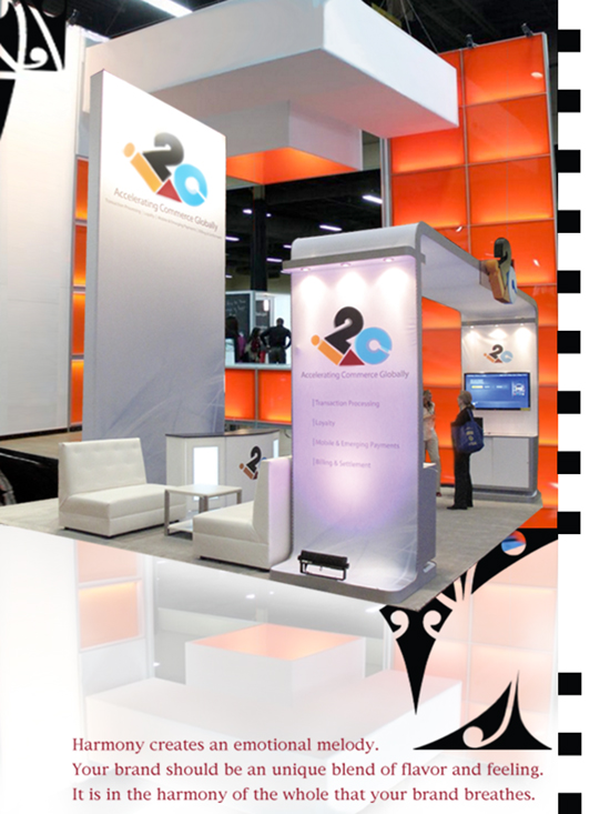 "Always aim at complete harmony of thought and word and deed." (Mahatma Gandhi). To this wise adage if I may add, aiming harmony in design is crucial; I do not think I will be too far off. Harmony pulls the pieces of visual elements together. It drives at achieving visual rhythm at trade shows; notoriously known for clutter and chaos. Adjacent colors, related textures, similar shapes and of course the golden ratio are the principal attributes in fostering balance and congruity. Start with a limited color palette. Use tonal contrast as the key element to emphasize focal point. You might want to play with formal balance or an informal balance for the overall movement. If the sentiment of your brand is dignified, restraint and conservative you might want to go with formal balance. Elements on the right side of your display mirrors the left side in size, placement, shape, and color. Usually banks and retail sector might go with this kind of a structured layout. If the brand is conceived as exciting and playful, informal balance is the way to go. There is imagination, randomness and discovery at play here. If you wish to promote activity, excitement, and variety use informal balance but nevertheless there needs to be some kind of connective tissue that unifies your exhibiting space. Harmony in your booth design is bound to amplify the voice of your brand. If some contrast is weaved in this spatial harmony it makes the brand exciting and memorable. Understatement is always better. Sometimes a tiny bit of contrast is all that you need. Be it flooring, lighting or perhaps interjecting some curvacious furniture is all that you need. The principles of harmony and contrast may seem completely contradictory, but it is the fine balance between these two that dictates the dominance of brand. Articles you might like
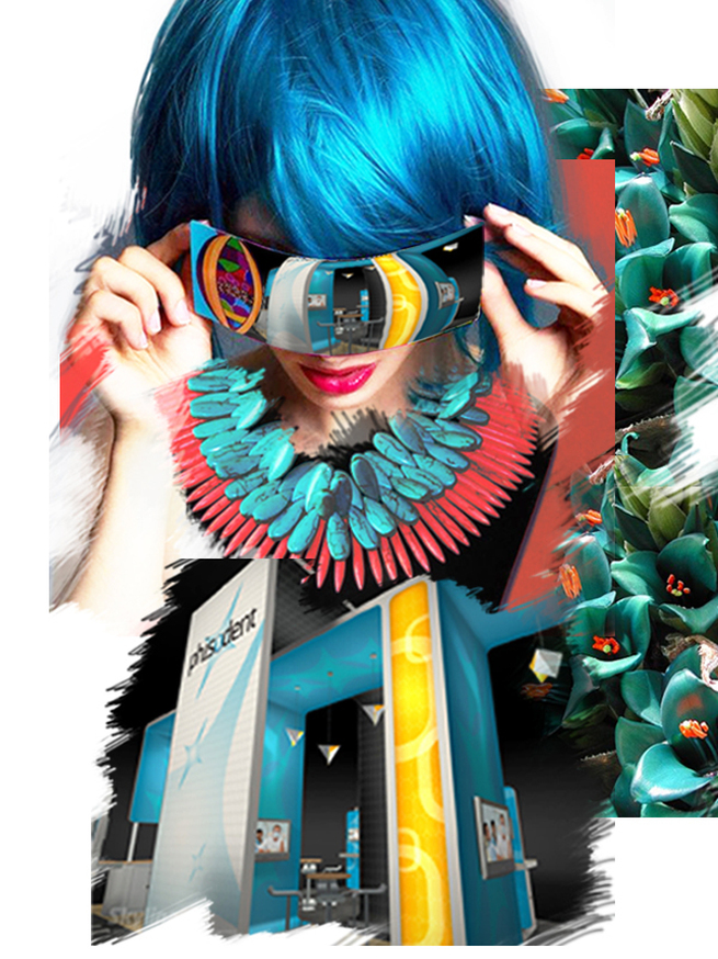 I believe, Goethe was the first man to challenge Newton's theory of light and color based exclusively on physical phenomenon. He was the first one to point out that color sensations interacting with our brain cells are based not on the principle of optics but more so on our perceptions of our primal emotions. In his color teachings, Goethe called the color blue a “delightful nothing”. Blue is pleasant, because “it doesn’t press us, but only lingers”; it gives a feeling of boundlessness and space. The ancient Greeks acknowledged blue to be nothing of material origin; "a color of perspectives, ethereal as the color of the sky, the ocean, the shadow of the moon, the unreal." Hence, it is no surprise that blue is the overwhelming favorite brand color. It conveys dependability and consistency in a business world that is anything but consistent. When brands are expressed in the experiential visual market place like trade shows; it is also no surprise that blue is the safest color of choice. Safe but not sure. A close relative of blue is turquoise. It renders the peace, calm and stability of blue; balance and growth of green and the stimulation of yellow. Turquoise recharges our spirits and grounds us during times of high sensory overload. It assists in the development of organizational and management skills. It is a silent influencer rather than a demanding look at me. Hint: Pepper your communication areas with this color. Balanced between the extremes of red and violet, turquoise is the color of equilibrium between our emotions, thoughts and speech. Turquoise is a friend of public speakers as it calms the nervous system, gives control over speech and expression, and builds confidence. Hint: Design your stage area with turquoise overlays. The very least: print your speech notes on turquoise. You will feel the stabilizing effects of this color every time you glance at it. Turquoise hoists the levels of creativity and sensitivity. With confidence it forges ahead; balancing the pros and cons, the right and wrong, of any situation. Hint: Use it in showcasing your existing products or to highlight a new product. Play with the variations of turquoise to exhibit an environment of strength, triumph and poise. Use aqua for re-freshing strength, aquamarine for dynamic exhilaration and sophisticated teal for age old commitment. Turquoise is ideal for both the male and female audience of all ages. Combine with red, orange or yellow for targeting the active, male principle. Flavor it with soft pink, lavender or pale lemon for the female form ideal for the fashion industry. Coming from a culture of brilliant technicolors, I am eternally fascinated by its diverse dimensions. I share with you as I learn more and more of it. However, the inspiration for this write up comes from White Oleander. “She would be half a planet away, floating in a turquoise sea, dancing by moonlight to flamenco guitar.” Emotions so richly experienced by weaving nouns and verbs.....The clutch of colors in our collective psyche! Articles you might like
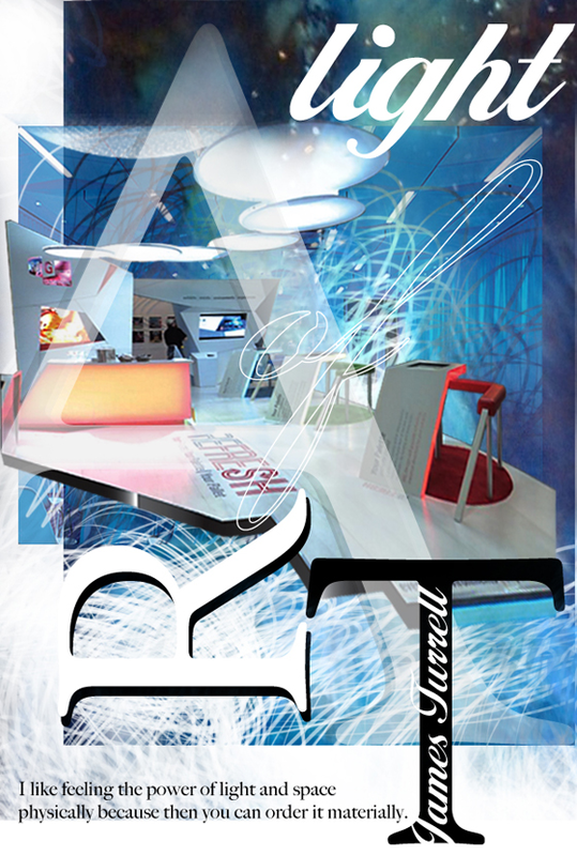 Light is not so much something that reveals, as it is itself the revelation: James Turrell Ancient architects and masters knew this. They created their temples that literally came alive during certain times of the year. Architecture and light are mutually dependent. The Italian architect, Bruno Zevi called “light as an architectural form”. Le Corbousier, the pioneer of modern high design held light to highest stature. He said “architecture is the learned game, correct and magnificent, of forms assembled in the light. ”. Dynamic design establishes a play of light and shade, and appropriate lighting commands the mood and the mind of your attendees. Again in the words of James Turrell: Light is a powerful substance. We have a primal connection to it. But, for something so powerful, situations for its felt presence are fragile. I form it as much as the material allows. I like to work with it so that you feel it physically, so you feel the presence of light inhabiting a space. I like the quality of feeling that is felt not only with the eyes. Trade show exhibitors and designers are well in-tuned with this quality of feeling. It is a guaranteed return on investment when it comes to the play of light and light projections. However, we are also painfully aware that it comes with a ticket value that screams "premium". Not any more! In recent years, event lighting has gained tremendous momentum and is forging ahead in the form of LED illumination and incandescent lighting. Event lighting allows anyone to add delightful rich color on any surface of your display, flooring and ceiling. Create a central theme throughout your space or define zones and boundaries. Use the infinite color combinations of the LED washers to enrich your hanging signs or your ceiling structures. Another, creative way to add form to your space is by adding pendant lights at varying levels. Create a sculptural definition to enhance the feeling of space. Transform the spatial context, create agreeable, sublime or mysterious sensations. Enlarge a space, make it smaller, or simply highlight aspects of the space that will interest your target audience. Have fun with it. More importantly, feel it. Touch the heart of your visitors with the effects of light. Your brand will gain vitality and a permanent residence in their memory! Articles you might like
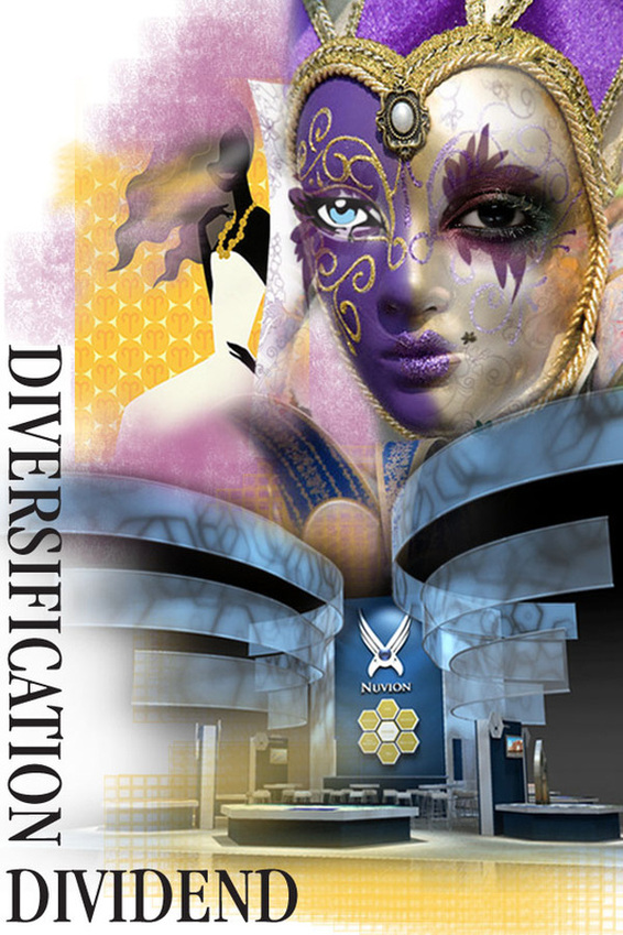 In the summer of 2007, the US stock market plummeted by 5%. In the same week FTSE lost about 5.6%, Israeli TA 25 Index dripped 7% and Australia exchange shed 3%. This was mirrored across the global stock markets. Singapore, Hong Kong, South Korea, India and China all followed suit. As the financial instruments of the developing and the developed countries have started to look alike "we have voluntarily narrowed our options to the point of jeopardizing our ability to survive." Nature, does not condone singularity. It leads to extinction. Rebecca Costa in her book, The Watchman's Rattle: Thinking Our Way Out of Extinction, says, in evolutionary terms, diversity acts like a genetic insurance policy—to guard against the complete eradication of species. This is reason why there are 17,500 species of butterflies in the world, and around 750 species in the United States (Encyclopedia Smithsonian). A species that develops a broad range of characteristics and behaviors—wide diversity—increases its odds of surviving a broad range of environmental challenges. In December 2004, when the great Tsunami claimed more than 150,000 lives, the stone age tribes of the Andaman and Nicobar islands escaped unscathed because they took to the forests and higher ground well in time. Dr. Yaneer Bar-Yam of Harvard University exposes the critical role diversity plays as complexity in business grows: "A system performs well in facing complex challenges when it has high variety. We can understand this in the case of the modern economy and technological and corporate innovation." The greater the diversity of ideas, products and services, the more effectively businesses can respond to dramatic shifts and changes. For that reason, Apple has products that ranges from defining nano life style to the dream machines of the 3D designers and artists. For that very same reason, the latitude of Skyline products range from extreme portability to custom modularity and not to mention more than 30 elastic product lines in-between. For that very same reason, exhibit designers of our times should incorporate the essence of the brand in the visuals, architecture and of course, need-less to say in the interactivity that is the hallmark of face-face-marketing. Socio-biologists confirm that some 5 million years ago, with the development of two-legged locomotion, our brains experienced intricate adaptation to an "avalanche of new sensory complexity". If that is true, we are yet again undergoing paramount changes in the frontal cortex, the area that processes complexity. We are on for an interesting ride! Articles you might like
 As the media welcomed 2012 with a frenzy of doom and gloom, Skyline announced the transition to EcoFi fabric for all its' portable pop-up dispalys; thus taking a firm step towards protecting our precious natural resources. EcoFi Fabric is made from 100% post-consumer water bottles. Approximately, 80 water bottles make up one complete pop-up display! This is indeed very exciting for our industry that is known for its phenomenal waste and of course, it adds another earth-friendly layer to the existing eco-friendly portability of the Skyline brand. This is good news. However, truth be told, petroleum-based plastic bottles can be recycled only once and then it goes to landfill where is takes about 700 years before the decomposition starts. The greater news is — the researchers at IBM have come up with a way to make plastic from plants. The "green chemistry" breakthrough using organic catalysts" results in plastic that is capable of being recycled again and again and again unlike its petroleum based plastic counter part. This breakthrough that promises biodegradable plastics made in an energy-efficient way has been said to herald an era of sustainability for the plastics industry. In fact, this is only one of the many technological and biological revolutions that is materializing right now as we speak to usher us in the age of Abundance. Abundance—the Future is Better Than You Think—is an enchanting book by Dr. Peter Diamandis and Steven Kotler. It is an action packed ride immersed in a vision that challenges us to take bigger risks, create an innovation culture, and focus on solving problems rather than complaining about them. Exponential technologies, DIY innovators, Technophilanthropists and Rising billion—are the four emerging forces that are conspiring to aid human evolution in the next 20 years. Thus, 2012 is indeed the symbolic marker into an era of sustainability, peace and innovative solutions in every field. "We don’t believe abundance happens automatically. It’s up to each of us. That’s what makes today so different. We face enormous problems, but we—as individuals—have enormous power to solve them. It really is a magical time.......But ultimately, abundance is about creating a world of possibility: a world where everyone’s days are spent dreaming and doing, not scrapping and scraping." A thrilling odyssey published for our times. Happy Reading. Articles you might like
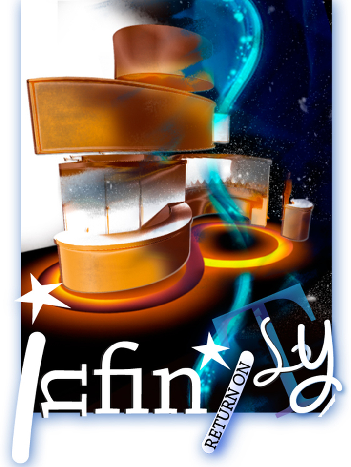 "The infinite! No other question has ever moved so profoundly the spirit of man; no other idea has so fruitfully stimulated his intellect; yet no other concept stands in greater need of clarification than that of the infinite . . ." David Hilbert (1862-1943) The very title "Return on Infinity" is in itself ridden with self-contradiction. How do you even begin to harness the infinite concept of "Infinity". Given that the concept has been contemplated by artists, philosophers, mathematicians and common man since before the beginning of written history, it is infinitely pompous of me even to delve into it. However I do have to acknowledge: unconsciously, I use it as a design crutch every single day. Consciously, I might as well give it proper credence. Famed intellectuals have presented varied concepts about their understanding of infinity. It is as though infinity upholds different meaning for different appeals. As the underground, Russian poet, Joseph Brodsky so rightfully said, "The poetic notion of infinity is far greater than that which is sponsored by any creed." Rudy Rucker in his book, Infinity and the Mind, undertakes a captivating journey to that frontier of the universe he calls the "Mindscape," where he explores infinity in all its forms: potential and actual, mathematical and physical, theological and mundane. Rucker clues us on Kurt Friedrich Gödel's rotating universe, in which he postulates possibility to travel into the past and spells out an interpretation of quantum mechanics in which billions of parallel worlds are produced every microsecond. In the kingdom of infinity, mathematics, science, and logic merge with the marvelous. It is a continuous ebb and flow of hard logic and fluid mysticism. The conundrum that arise from this merging, explains the illusive human mind: its potential, its powers, and its frailty. In their temples, the Egyptians from antiquity followed a simple layout that mirrored the concept of infinity: the creation of the universe: both metaphorically and structurally. In their usual customary creations, architects, industrial designers and 3D trade show designers are known to play with the flow. The flow of the infinite curve that is. However, architect Serge Salat, takes a giant leap beyond. In 'Beyond Infinity', he brings the abstraction of infinite into finite. It is a multisensory voyage painting “the possibility in the contemporary world to create new beauty and dream through a fusion of classical culture and innovation”. Perhaps, this is the first time in known history one gets to delight on the stark theory that space and time is immersed in an unending subdivision! Enjoy! serge salat: beyond infinity from designboom on Vimeo. [Paradoxes of the infinite arise] only when we attempt, with our finite minds, to discuss the infinite, assigning to it those properties which we give to the finite and limited; but this I think is wrong, for we cannot speak of infinite quantities as being the one greater or less than or equal to another. Galileo Galilei, quoted in Infinity and the Mind by Rudy Rucker. Articles you might like
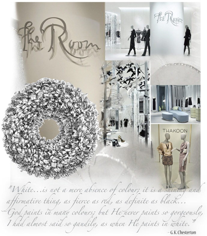
 I believe it is our "collective consciousness" that leads us to follow trends. The simplest way to think of this phrase is to gauge an idea or style that we all share, whoever specifically "we" or the "tribe" might entail. A very good example is the Apple brand. It is associated with high design and intuitive purity. This trend has now made its transition into experiential marketing as well. White is now the leading-edge sensation. Freshness, purity and new beginnings are the under-tone connotations of white. It is no wonder that white is the dominant color of choice in some trade show venues. It seems that the emerging Intersolar 2011 is a prime case study of white in the third dimension. The exhibiting brands were so focused on expressing cleanliness, clarity and wholeness so much so that they sacrificed their individual potential to be remarkable and distinctive. All to be part of a "trend". And that is outright feeble. Trade shows and events are advantageous arenas for rendering your brand uniqueness. Like humans, each brand has it's unique DNA. In marketing terms it is called "Unique Sales Proposition". Designing a space that speaks to this uniqueness is a major advantage in developing a great messaging platform and a memorable encounter. Over the ages, designers, artists, philosophers and thinkers have been guided by the Spirit of the Time Design Value. This design value is based on the conception that every age has a certain spirit or set of shared attitudes that should be utilized when designing. Clarity and transparency is in the collective consciousness of our current times. Hence, the dominance of white is profound. This is the reason why the challenge to be different is equally pivotal. Introduction of surfaces, textures, hand-illustrations and lighting that confirms to this common consciousness but strides to be peerless is one way to foster brand memorability. Always remember: your brand is a singular expression. It is unique and unrepeatable. Articles you might like
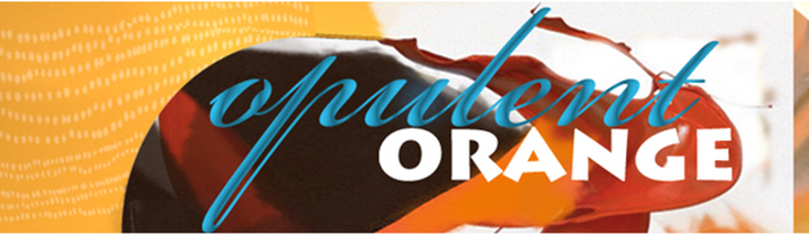 Resting in magnificence, between passionate red and optimistic yellow, is the fun flamboyant orange. It evokes a contradiction in dualism. It is a "love me' or a "hate me" color. Orange is that color that has manifested in our reality as an envoy of safety as well as an agent of death. It is the requirement of OSHA that certain construction equipment and accessories be painted safety orange. Dioxin in Agent Orange is known to cause cancer, birth defects and dysfunction. The psychological effect of orange is instantaneous. It screams attention and haste. It gives strength and energy to your visuals, delivering an instant impression that is most often universally understood. Orange work wonders in chaotic market places like trade shows. It exudes energy and confidence and stimulates activity. It is often called the "silent salesperson" for it encourages people to gather and socialize. It also inspires physical confidence and individualistic independence. Orange is a high-arousal color. It relates to the primal gut instincts. It is the color of the Sacral Chakra. It is the seat of our inherent creativity. The energy associated with orange brings about increased feeling of motivation, well-being, positive thinking and inner joy. Perhaps, that is the reason the color choice is saffron for the sages and seers, since the beginning of time. Use orange to stimulate your appetite and your performance. 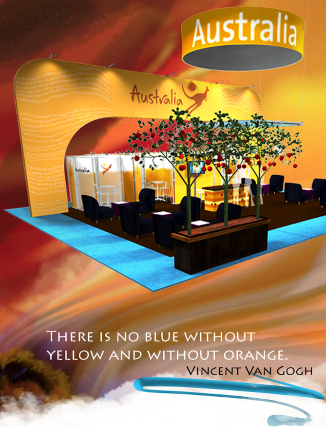 Orange is always on the move. Orange brings out the extrovert in you and releases you of your inhibitions, often encouraging you to express your inner calling. It is the color of adventure. Use it as your guide. It will not fail you. Find yourself. Be the blazing trendsetter that you are! Articles you might like
|
Archives
September 2020
Categories
All
Don’t bend; don’t water it down; don’t try to make it logical; don’t edit your own soul according to the fashion. Rather, follow your most intense obsessions mercilessly. Franz Kafka |


 RSS Feed